When you see the logo of your favorite brand, it probably makes you feel excited, comfortable, motivated—whatever the feeling, it attracts you to that brand.
It only takes us about 400 milliseconds to attach a particular meaning to an object after we see it, according to researchers.
This is how logo design can impact purchase decisions.
Every logo conveys a meaning to customers in less than half a second. If a customer doesn’t recognize a brand, they will regard it with more suspicion at first, until they prove assumptions right or wrong. Brands they are familiar with, on the other hand, have an established perception about product quality, customer service, value, popularity and more.
Let’s take a look at how that works!
Logos Influence Purchase Choices
Logo design is important because it influences assumptions about the brands they represent.
You have different feelings towards Nike than you have towards Russel, Adidas or Air Jordan, right? Even though they make similar things. When you see their logos, you have subconscious feelings about the brand based on past experiences and their branding choices.
The same goes for you: When people see your logo for the first time, they form a certain perception of your brand.
If the perception is good—they think you are going to create value and deserve trust—then you would have to mess up to change their feelings. But, if the perception of your logo is bad—that you look cheap or amateur—then you’ll have an upward battle to fight to even get a chance to prove something different. You’re already behind the eight-ball if your logo doesn’t do your brand justice.
Now, there are several design elements that can play a role in affecting your audience’s perception of your brand, starting with fonts:
The Psychology of Fonts
There are thousands of fonts—possibly a million or more choices—in existence. While some fonts are made professionally, providing beautiful symmetry, flow and spacing, other fonts are clearly from amateurs and will cheapen anything they’re used for.
Brands will usually choose 1-2 fonts for their logo and another standard font used in the body copy of their website, pamphlets and more.
Different types of fonts are going to give off general perceptions when combined with other design elements for a logo or branded materials. These are some of the most popular logo fonts:
Serif fonts
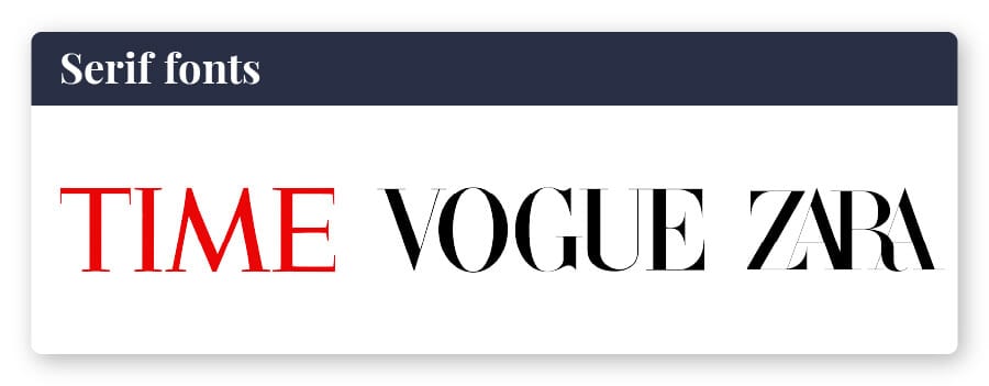
Times New Roman may be the most classic example of a serif font. The little line or stroke that hangs from the upper, outer corners of the letters is what makes this font a serif font.
The serif fonts are classic, formal, established, authoritative and trustworthy. They tend to look unimaginative, conformist and buttoned up. In the right setting, this creates a confident and timeless branded look. In the wrong logo, it looks like no thought was put into font selection.
Time magazine uses Times New Roman for its classic title. Vogue uses a modified version of Didot to create a special version for its logo that won’t be reproduced. The brand Zara also uses Didot in their logo, though the kerning (spacing between letters) is turned way down, crowding all the letters together.
Some examples of popular serif fonts are Times New Roman, Bodoni MT and Georgia Pro.
Sans-serif fonts
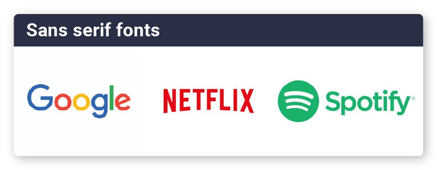
“Sans” means “without,” so a sans-serif font has none of the little marks on the tips of the letters. Arial is the most classic form of this font, though the decision of Microsoft to switch its default to Calibri in 2007 may soon have it take the top place for sans-serif fonts in common use. The company recently announced they are in the works of establishing a new default font for the future.
San Francisco is currently the default sans-serif font of iPhones and iPads.
Sans-serif fonts are clean, modern, simple, straightforward and honest-looking. They portray forward thinking and agility.
The multi-colored Google logo uses Product Sans—a typeface Google created in 2015 for logo purposes. Netflix used Graphique, originally with a heavy shadow, before swapping it out for a more modern (and flat) version. LinkedIn used a combination of Myriad Pro-Bold for their “Linked” and Myriad Pro-Black for “In” to create their logo.
Examples of sans-serif fonts include Ariel, Helvetica, and Verdana.
Word of warning: Never, EVER use Comic Sans in logo design or branding—that ugly sans serif font has become a laughingstock of anyone with any design sense and will immediately mark your brand as amateur and out of touch!
Slab-serif fonts
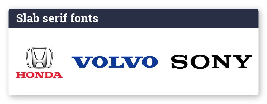
Slab serifs use thick, horizontal slabs to form the letters. You will notice little to no shifting of thickness in the letter strokes as they bend. The serif marks are even thick and horizontal without much tapering.
Slab serif fonts are bold, confident and forthright. They show a little attitude without going beyond professionalism.
Honda uses a recognizable logotype with a custom headline typeface to contrast with their “H” logo. Sony created its own Sony Font, though it’s very similar to the original design that was done with Clarendon. Volvo also uses Clarendon for its slab serif logo.
Other examples of slab-serif fonts include Rockwell, Memphis and Neutraface Slab.
Some printing processes (like screen printing) will limit how many colors you can use. Others won’t have the ability to create gradients easily or won’t have the capability to include tiny details (like embroidery on hats or shirts).
You may end up limited in what kind of printing you can do if you choose a complex background. You could also create a logo version that doesn’t include the background for these situations.
Script Fonts
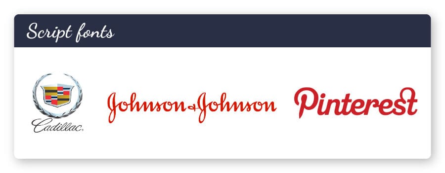
The flowy lines of script fonts are captivating and beautiful. When used correctly, they offer a feminine quality and set the brand apart. Designers are wary of script fonts, since they can also be hard to read quickly.
A script font will showcase creativity, elegance and compassion. Script fonts make your logo look exclusive and unique.
Pinterest created their own script style “P” to make up their logo, which takes on the shape of an abstract push pin. Cadillac leans on English 157 with the assumption that you will already know their brand. Johnson & Johnson uses a version of Adelica Brush Regular for their easily recognizable font.
Examples of script fonts include Brush Script MT, Script MT Bold and Vivaldi.
Display and decorative Fonts
companies create their own versions of fonts that can break the rules for normal fonts and enter the realm of something else.
Display and decorative fonts are stylized, distinctive, dramatic and fun. They break the mold in an unapologetic way. In most cases, you really need a font designer to create a truly unique decorative font for your typeface.
Disney has an iconic logo with a font that is almost a script font. IBM uses a stylized slab serif with lines through it for a distinct look. Lego uses playful bubble letters in a sans-serif font that can only be identified with its brand.
Examples of display and decorative fonts include Jokerman, Showcard Gothic and Ravie.
The Psychology of Logo Colors
very color has meaning in our minds. Colors make us feel excited, calm, motivated and energized. Logo colors use our natural responses to color to provoke feelings about a brand.
Black and white
Often gives a look of elegance, confidence and maturity. Black and white logos are very popular in the fashion industry. Examples of brands with B&W logos include Chanel, Loreal and Dyson.
Gradient colors
One innovative approach to color could include a shift from one color to another. Gradient color tends to look modern, unusual and controversial. Gradient logos aren’t a classic choice because historically they wouldn’t print well, but digital use and improved printing technology has lessened this issue. Examples of brands using gradients include Instagram, Firefox and Asana.
Bright colors
Using yellows, oranges, reds and other bright colors can spark a higher level of energy. Bright colors are youthful, energetic and excitable. Brands that appeal to children often use bright colors to help catch the eye. Examples of brands using bright logo colors include Spotify, Lyft and McDonald’s.
The Psychology of Logo Shapes
Every shape in your logo design is also going to convey certain feelings. The overall shape of your logo may have the most immediate impact on its meaning to the consumer.
Geometric shapes
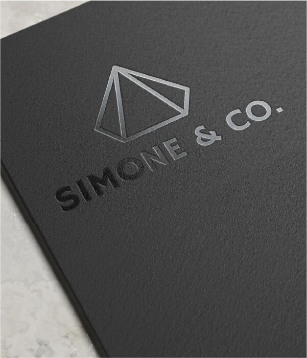
More harsh and structured, geometric shapes can convey stability, dependability and action:
- Circles often express movement and unity
- Contrived or pulled from nature
- Squares are symbols of strength and longevity
- Lines can illustrate future thinking and energy
Organic shapes
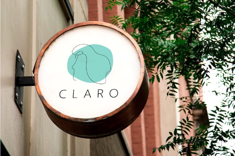
Often used for more nature-based brands, organic shapes are natural and feel comfortable. Some organic shapes could include splatters, like the Nickelodeon logo, that show energy and youthfulness.
Organic shapes aren’t confined to the rules of geometric shapes, so they often convey a brand that is agile and more go-with-the-flow.
Abstract shapes
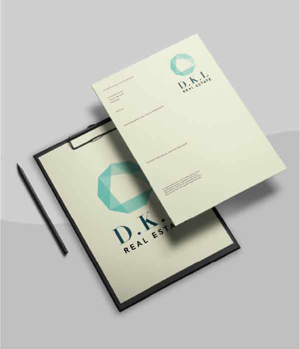
Logos using abstract shapes are trying to convey a feeling rather than a specific meaning in their logo. Pepsi is a great example of a brand using abstract shapes to establish a feel.
This can make a brand appear edgy, modern and connected to their audience. Abstract designs can form intriguing logos that will make people stop and think about the meaning they are trying to convey.
The Psychology of Composition
The brain is wired to read information. So, when looking at a picture, we tend to scan from left to right. When it comes to art and design, the goal is to keep the eyes on the image. Your logo can pull people in with the right composition.
First of all, the core of your brand should stand out in the logo. The most important element will be the most prominent and noticeable. You can further set this focal point by using slightly thicker outlines around that shape, increasing its size or using a contrasting color. In busy logos, setting a clear focal point is especially crucial.
Next, watch out for how the eye can be thrown from the design. As your eye travels in from the left side of the design and heads towards the right, is it encouraged to keep going?
Using a line that closes off the side may help the eye circle back around for a second look. You can’t hold people forever, but a good design composition will keep them for just a fraction longer—which means more time to make an impression.
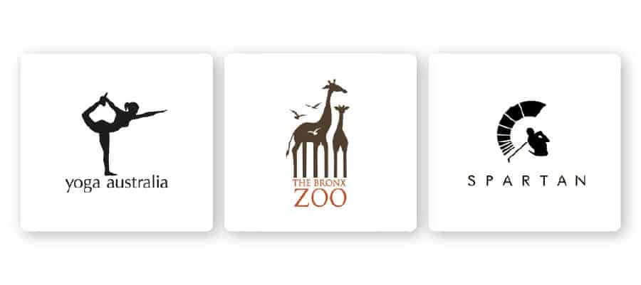
Use negative space and hidden meanings to create even more intriguing details that will grab attention. Great examples of this include Yoga Australia, The Bronx Zoo and Spartan Golf Club
Over to You
Your brand will be represented by your logo, so create a logo that really communicates all the right things to your audience and helps shape their opinion of your brand! Get started today with our easy-to-use logo maker tool and create your own company logo design.
