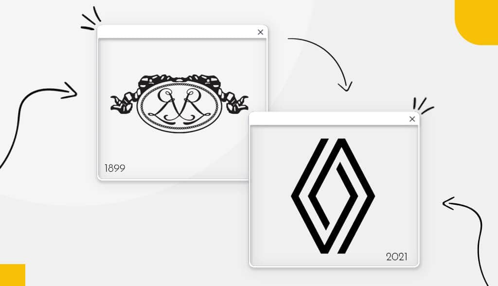
An important part of logo design is to look back at the logo history and evolution of industry giants. If you are in the auto industry, it’s worthwhile taking a close look at Renault’s logo evolution. You’re guaranteed to learn something new and gain some inspiration for your logo.
Renault’s logo design has seen a total of 18 designs over its 123 years of being in business. Read on to discover how Renault’s logo changed so drastically over the years.
A Brief History of Renault
In 1898, a young engineer named Louis Renault designed and produced cars before teaming up with his siblings, Marcel and Fernand, to found the Renault brand. The brothers drove their own vehicles in races to promote their business. After a series of unfortunate events for the family, Louis remained the only brother in the business. However, during that time Louis ran Renault, it prospered.
When the First World War began, Renault manufactured aircrafts and tanks. Although Louis Renault became increasingly unpopular towards the end of his life, the company he helped found remains a fixture in the auto industry to this day. Today, the French auto corporation sells its vehicles in over 200 countries.
Renault’s Logo Evolution
As you’ll see below, Renault’s logo changed so much over the years that comparing the first logo to today’s, you wouldn’t be able to discern it’s the same company. Let’s take a closer look.
1899 – 1906
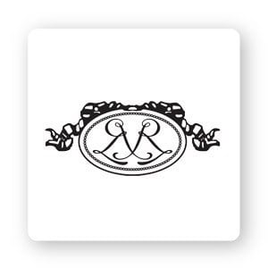
The very first Renault logo design featured a double oval shape border topped with ribbon trim. The logo design can be described as simple, yet intricate and beautiful. The center showcased the initials of the brothers in a script-like font defined by complex lines and curves.
1906 – 1919
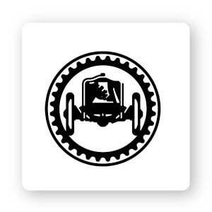
The oval shape was replaced with a circle, but more interestingly, the inside border closely resembles a gear. The center of the logo no longer featured the brothers’ names, but rather a drawing of a car. This was an important change because then people were able to easily recognize what kind of business the logo represents.
1919 – 1923
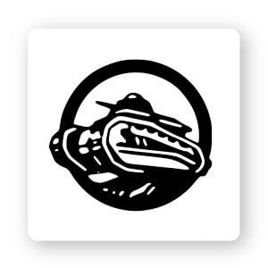
World War I had a profound influence on the logo redesign during this time. It might be difficult to tell because the lines are so thick, but the logo has been stripped down to just a tank plowing through a circle frame.
1923 – 1925
This is the first time the brand name is featured in the logo. The only thing Renault kept in this design from the previous one is the circular shape. There’s no more car or tank icon, just thick black lines interrupted with white lines. The word Renault is written in uppercase block letters.
1925 – 1930
This is the first time Renault used a diamond logo, which the brand would continue using to this day. The inner pattern is meant to resemble a car’s grille, as well as the company name. This time, Renault is written with a thick serif font as opposed to the previous logo which wasn’t colored in.
1930 – 1945
The 1930 redesign got rid of the outer frame, making the overall vibe more modern and confident. Renault still decided to stick with black and thick parallel lines as their central focus. The Renault name remained in uppercase serif lettering.
1945 – 1946
What’s interesting about the 1945 redesign is that it only lasted a year before they hit the sketchbook again. As you can see, there are some obvious big changes. First, they replaced black as the main color with gray and yellow. The logo also took on the shape of an emblem, which is often used by companies that have a long history. You’ll also notice that inside the emblem they retained the diamond. The new inscription reads “Regie Nationale Renault France.”
1946 – 1959
In 1946, Renault ditched the emblem and went back to their tried-and-true diamond shape as the sole element. However, this time, the Renault diamond was now yellow and black, which represents friendliness, youth, and warmth. Previously, the brand used a serif font for the company name, but they replaced it with a sans-serif for a friendly and modern feel.
1959 – 1971
Renault’s next redesign of ‘59 reverted to their earlier logos. The company’s name remained front and center inside the diamond; the diamond was named “Pointe de Diamanté”, which means “diamond tip” in French. The diamond was slightly narrowed and elongated making the overall brand aesthetic more elegant.
1971 – 1972
Renault’s logo underwent a major overhaul. A bright yellow square frames 2 white arrow-like icons creating a diamond in the negative space. Previously, the company’s name was centered, but now it’s on the bottom of the logo enclosed between 2 black horizontal lines.
1972 – 1981
As you can tell at this point, Renault retained a few key elements in their logo no matter how much it changed. First is the black and yellow color palette, next is the diamond shape, and lastly is the sans-serif font. Over the next few logo redesigns, you’ll notice that these elements show up.
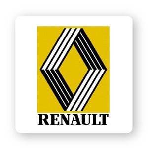
1981 – 1992
Many of the same elements of the previous logo are present here. This redesign is more like a trimmed down, sleek logo. The brand decided to tone down the bright yellow to a darker shade. Renault’s designers keep flip-flopping between serif and sans-serif font for the typeface. This time they went with a timeless serif font with thick lines and distinct serifs (stroke) on the ends.
1992 – 2004
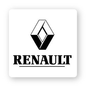
The 1992 redesign took on a 3D shape giving the overall logo a strong and eye-catching look. The Renault name appeared under the diamond icon in the same font as the previous logo.
2004 – 2007
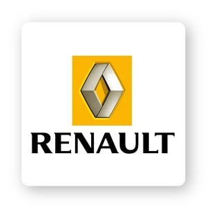
They brought the yellow/orange color scheme back. And this redesign enhanced the 3D effect all thanks to the metallic shades and shadows of the diamond. The Renault font is still a serif, but with a less obvious serif (stroke).
2007 – 2015
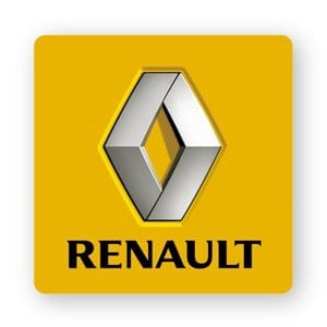
No, your eyes don’t deceive you and I didn’t make a mistake—the last logo and this one are virtually exactly the same. The one difference is that Renault moved their company name outside the frame to inside the orange box. Never underestimate the little things, right?
2015 – 2018
And the yellow’s gone again (they really couldn’t make up their mind!). The diamond kept its metallic, 3D appearance. The text looks very similar to the other logos, but the serif type was changed again and the letters were placed further apart.
2018 – 2021
3D was out, minimalist was in. The new Renault logo design was based on flat lines and a monochrome palette. The serif Renault text was replaced with sans-serif, and they moved the text to sit in the center of the diamond like it was in the early days of the brand. The diamond is made up of parallel lines that also hearken back to the company’s earlier logos.
2021 – current
Now that you’ve reached the last logo redesign, you can probably tell how they got to this point. Meaning, all the logos that came before took inspiration from the one before them. 2 single lines that are interconnected to create the iconic diamond shape.
Over to you
Renault’s logo evolution tells an interesting story about a brand that was finding its visual identity. The French auto company went through many logo redesigns over the years, but it’s always maintained essential brand qualities. Their current logo is sleek, modern, minimal, durable, and timeless. If you’re creating your own logo, consider how you can portray these traits as well in your design.
