You’ve chosen a niche, set up your blog or website, and are ready to put the final touches on your site before you go live and spread your message to the world.
Now that the main website designs are out of the way, it’s time to top your blog off with a cool logo!
Every blog and website needs a logo, regardless if you’re a small business blogger or a hobbyist with a wealth of knowledge about a specific subject.
Don’t get me wrong; your logo isn’t just for your blog. You’ll also use it on your social media pages – Facebook, Twitter, Instagram, etc. – to help spread the word about your blog and personal brand.
Why Do You Need a Blog Logo?
For better or worse, there are a million other bloggers out there, and chances are that whatever you’re planning to write about has been covered before. In fact, there are over 35 million active websites on WordPress’s platform, and 77% of internet surfers (meaning, everybody) regularly read blogs to get information.
When people get to your site for the first time, they’re going to need a way to remember you out of all the other blogs in your niche. Once you lose a reader, chances are few and far between that they’re going to find you again, unless you have a logo – a visual cue – that will help them do so.
Additionally, having a blog logo will help you:
Make a great first impression. If designed well, it will instantly pique the interest of your readers and encourage them to check out your site.
Position yourself as an authority. A logo tells your readers that your blog is professional, and that you’re qualified to write about the subjects at hand.
Build brand recognition. As part of your brand, a logo will help you stand out in your niche and build recognition amongst your readers.
Create a brand identity. Your logo is the foundation of your brand, and it will help you create an emotional connection with your audience that turns them into loyal readers.
Types of Blog Logos
There are 9 different types of logos that fall under 3 main categories: Icon-based, text-based, and combination marks (logos that incorporate both words and symbols).
In general, the most common type of logos you’ll see on blogs is a wordmark logo, or a logo that is based off of the name of your blog – whether the full name or a monogram – and nothing else. These logos put a lot of emphasis on the typeface you use. (We’ll discuss this in more detail below.)
However, you can also go the combination mark route and find a symbol that expresses something related to your blog name or the type of content you’ll be posting.
We’d recommend against using an icon on its own, because it may be harder for readers to associate the logo with your blog if it doesn’t have your name to accompany it. Remember, your logo can help you build brand recognition, so you’ll want a design that your audience can easily remember.
Here are some of the most popular types of blogs and the logos that fit each one best:
Personal blog:
Like we mentioned, these blogs are best suited towards wordmark or monogram logos.
Make sure to use your own name in your logo, so that your audience can begin to identify your logo with the voice that they’ll read – and hopefully connect with – on your blog. You may want to try using a hand-drawn font, or a style that mimics a signature, to add a personal touch.
Business blog:
If you already have a business, then you should also already have a logo! Notice how the Disney Parks Blog logo keeps the same font as the regular Disney logo, but with a slight twist on the color?
Marriott on the Move, on the other hand, uses their normal maroon palette while switching up their font. When deciding on your logo, you’ll want it to be a variation of the business logo that your audience has already come to know and recognize, so that they’ll easily be able to associate your blog with your business.
Niche blog:
You likely have a “niche blog” if you write about things like food, fashion, travel, DIY, fitness, gaming, tech, parenting, etc. In other words, a niche blog is a blog that caters to a crowd that is interested in a specific topic.
For that reason, you should consider using a combination mark for your blog logo. This will require a little digging on your end to understand which icons, fonts and colors will resonate most with your niche. For example, Tech Savvy Mama uses a blue color palette to create a sense of trust with her readers, while The Book Smugglers have a serif font that lends their logo a sense of timelessness and traditionalism.
If you know of other blogs that are in a similar niche or industry, scope out their logos and see if they have any overlapping design elements with one another. That should give you an idea of the types of logo styles that are resonating with your target audience.
With all that said and done, let’s get to the actual designing! Here are 5 steps to help guide you in creating the perfect blog logo:
5 Easy Steps for Designing a Blog Logo
1. Think about your audience.

This is arguably the most important part of your entire logo design process, because it will inform the rest of the decisions you make in the following steps.
Whether you’re a lifestyle, fashion, travel or personal finance blog, the logo you design needs to resonate with your specific audience for it to be effective.
Consider your subject matter, and then think about who your ideal reader is for that topic. What kind of people will be drawing to your blog? Who are you hoping to reach? Try to write down some identifying details about your target audience, including their suspected demographics and hobbies.
Why is this relevant? Well, a logo that uses thick fonts and multiple bright colors wouldn’t be appropriate for a blog about depression – just like if you blog about healthy living, a logo with a minimalist style and black as the primary color probably won’t appeal to your intended audience.
Make sure you have a good idea of the people your blog is meant to attract before moving on to Step 2.
2. Choose a color palette.
The colors you use in your logo should be consistent with or complementary to the color scheme of your blog or website.
If you haven’t yet chosen a theme for your website, all the power to you; you can build your theme around your logo! However, at this stage, most bloggers already have a website up and running, which usually includes a template (or, if you’re using WordPress, a theme).
What’s important to know is that the colors you choose will convey a certain set of emotions to your audience. Each color has its own “personality,” and in turn, influences people to subconsciously feel or think about something specific. For example, red inspires passion and energy, while blue is reminiscent of trust, power and reliability. Do your research on color psychology before deciding on your logo’s color palette.
You also need to be aware of logo color combinations that work well together and ones that don’t. Just like you want your logo colors to complement your website, you also need to make sure that they complement each other – both in appearance and in meaning.
When deciding on your logo colors, opt for a total of 2 or 3 – any more than that and you’ll likely confuse your message with a cluttered design.
While it’s true that digital mediums like blogs and websites are more forgiving of colorful logos, if you plan on branding offline as well (like with business cards or swag), you’ll want a logo that looks just as good in print as it does online.
3. Pick the right font.

If you’ve decided to go with a wordmark logo for your blog, then this step is the bread and butter of your logo. Your font will be the main visual element your audience focuses on, so you’ll want to choose one that best expresses the personality of your blog and brand.
(Even if you’ve included an icon in your design, your font will still carry a lot of weight, so don’t skip this step!)
There are 4 main types of fonts that are used in logos, although blog logos tend to favor script fonts and custom typefaces to give an extra level of creativity to the design.
That said, like with colors, the font(s) you use should be in line with your blog audience. Again, this depends on the nature of your blog; big, funky display fonts, for example, wouldn’t be suitable for a blog on tax information or accountancy. If you run a travel blog, however, fun, boisterous lettering would probably be the right move.
Also, make sure to to take clarity into account; some fonts – especially the more “creative” ones that dominate blog logos – can be hard to read, which defeats the purpose of having a blog logo.
Remember that your website visitors should be able to read and recognize the name of your blog from the logo at a glance, so if it’s a choice between a cool font and a plain but legible font, go with the latter.
4. Make a few versions.

At this point, you should have decided on the individual elements of your design (including an icon if you’re using one). Now, it’s time to test several iterations of your logo and decide which will look best on your website.
You may want to play around with shades of the same color palette or fonts from the same typeface family to make sure that each element works well together.
Also, create a few different layouts and tweak the positions of each element. Does the logo work better with the text front and center? What about with your icon to the right? Design 4 or 5 versions of your logo and see which one best tells the story of your blog.
Note that the dimensions of the logo placement area differ from theme to theme, depending on the website hosting platform you use. On some, the logo area will be pretty small, while on others it can be quite large. No matter the size, your logo needs to be clear and easy to read; so, before settling on a final design, test your logo at different dimensions to make sure the resolution looks good.
5. Choose a logo design tool
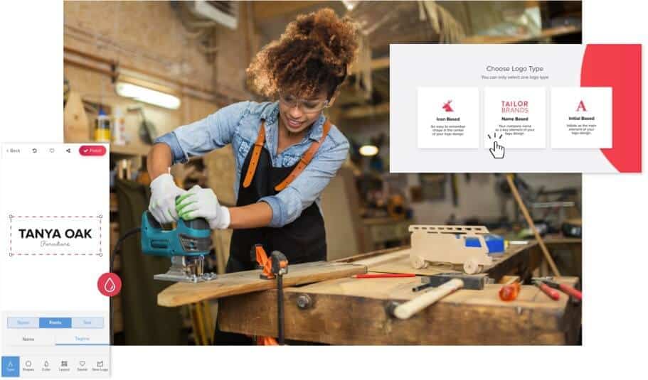
Once you have an idea of how your logo will take shape, it’s time to actually create it!
If you want to go the DIY route, you can use design tools like Photoshop, online logo makers, or logo maker apps if you need to design on the go.
Here are a few of our favorite options:
Tailor Brands – We’d be lying if we didn’t put ourselves first on this list. Our online logo generator is affordable and easy-to-use, and it comes with all of the branding tools you’ll need to create a brand identity for your blog.
Adobe Photoshop – Adobe is a professional tool used by designers. You can make professional logos, but you will need to pay for the software – and there’s a bit of a learning curve to master the software. If you don’t have graphic design experience, this may not be the best option for you.
PicMonkey – PicMonkey is a cool tool. It’s free to use and offers an online logo maker. It doesn’t have all the bells and whistles of Photoshop, but you can make a decent logo with it nonetheless.
Bonus Step: Add Your Logo to WordPress
As one of the most popular blog hosting services, WordPress makes it super easy to upload your logo!
Once you’ve created your design, you’ll want to use a transparent logo file (PNG) so that it looks good on any surface.
Log in to your WordPress website and click “Customize.”

Then, select the “Site Title, Tagline, and Logo” bar. In the new section that opens, click the “Add logo” button.
From here, choose “Upload Files” and upload your logo. Click the “Set as Logo” button on the bottom right corner, and that’s it! Your logo should now appear in the header of your blog.
Blog Logo Inspiration by Industry
Every business needs a logo, but each industry has its own design best practices.
Here are some of the most popular types of blogs by industry and the logos that fit each one best:
Food blogs
Whether you’re sharing tried-and-tested recipes for the ultimate gluten-free chocolate souffle or tips for healthy eating, the logo you design for your food blog needs to capture the essence of your brand.
As you consider the different elements that go into designing a logo (icon, color, typography, etc), think about the overall message you’re trying to send, the audience you want to reach, and your brand mission and values.
If you have a vegan blog, you might want a more earthy color palette and maybe an icon of herbs or vegetables. But if you specialize in hot sauce recipes, then you’d go with bold, spicy colors such as red and orange and an icon of a pepper.
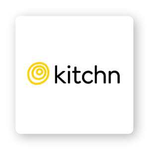
So let’s start taste-testing some of the most appetizing food blog logos in the industry starting with Kitchn.
Kitchn’s mission is to help make their readers’ lives happier and healthier at home through their kitchen. They helped convey their brand mission by using shapes. In logo design, different shapes can help forge an emotional and psychological connection between a brand and consumers. The Kitchn purposefully used a circular logo paired with yellow to express a sense of unity, friendliness, and liveliness.
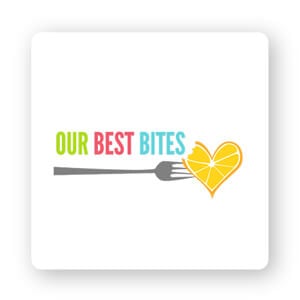
Our Best Bites uses the power of a strong icon to perfectly capture their blog’s vibe. I love that their icon is a fork and heart shaped orange (and a small bite mark detail too!). Our Best Bites’ icon is unique, fun, and most importantly, totally on brand.
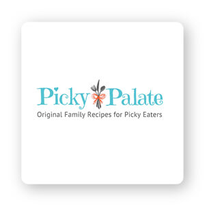
Picky Palate decided to go bold with a standout serif font with decorative spirals and a small heart shape dotting the ‘i’ in ‘Picky.’ As for an icon, the Picky Palate chose a set of utensils neatly tied together with a red string. From the typography, color palette, and icon, Picky Palate’s logo couldn’t be sweeter!
Recipe Girl’s logo consists of a cartoon version of the blogger herself happily holding a bowl and a whisk. A mascot logo is a great way to set yourself apart because it helps give your business a personality and humanizes your brand.
Now let’s talk about typography for a minute. Oftentimes, using multiple fonts can be visually appealing and help to differentiate the design—Recipe Girl logo being a case in point. Generally, fonts pair well together when there’s a significant contrast between the 2, which is why the Recipe Girl logo font works so well.

Personal blogs
A personal blog is a place the author wants to share their knowledge, thoughts, ideas, and personal life experiences with an audience. No matter if you’re a mommy blogger like Dooce or an entrepreneur sharing advice to others like My Wife Quit Her Job, a personal blog needs a strong personal logo.
As you think about creating your logo, you’ll want to find a design that reflects the essence of who you are as a blogger, the overall message you’re trying to send, the audience you want to reach, and your mission and values.
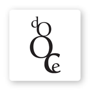
Heather Armstrong’s mommy blog, Dooce, was so popular because it was a space for readers to turn to for relatable content they couldn’t find anywhere else. The logotype is simple, with black lowercase letters spelling out the blog name ‘Dooce.’ But what makes it unique is the letters unevenly stacked vertically. The letters are also of varying sizes, which draws the eye in to take extra notice of the logo.
Dad or Alive is a blog confessing the truths of being a stay-at-home dad. And in typical dad style, the logo is heartfelt, warm, and authentic. The logotype looks like it was hand-drawn and colored in with a pencil, kind of like a doodle on a kid’s homework. The Dad or Alive blog logo gets an A+ in personal logo design.

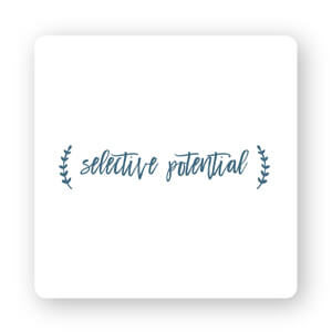
Speaking of typography, using a script font is another great way to connect with your readers on a personal level. Script often resembles handwritten letters, so it can appear playful, friendly, and whimsical. Just take a look at Selective Potential’s logo to see what I mean.
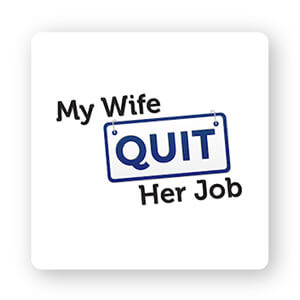
Finally, a simple shape or icon can “interrupt” your logo design in a way that draws your audience’s attention to a particular facet of your logo. My Wife Quit Her Job, a blog geared towards teaching people how to successfully create their own online store, does just that with the word ‘Quit’ – using the frame to represent a calendar and entice people to make the leap and become their own boss.
Fashion and beauty blogs
When it comes to fashion and beauty blog logos, it’s what’s on the outside that counts! That’s why it’s important to take some time in picking the right font that fits your fashion blog’s style.
Fashion and beauty blog logos usually tend to stick to logotypes (just the text) as opposed to a logomark (an icon). Fonts vary from handwritten, which gives off a more personalized feel, to minimalistic wordmarks that are also a popular logo trend.
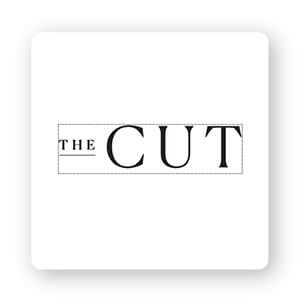
The Cut, for example, has a sleek font that’s on point for them. You’ll often see serif fonts like this one used in fashion-related logos, in that they call back a traditional, classy feel. Notice that their font literally ‘cuts’ at the edges of the letters, and it’s the perfect choice for a brand committed to sparking provocative conversations.
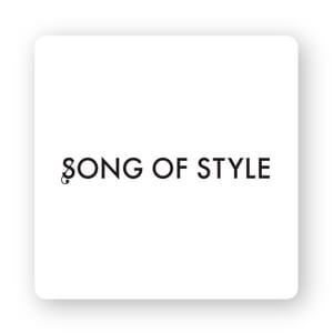
Song of Style takes their font in a different direction, with modern stencil lettering that is simple and clean. The only “flair” is a stylized ‘s’ which doubles as a musical note, instantly reminding readers of the blog name. Black, too, is a classic color for the fashion world, and in this case, it makes it easy to put the Song of Style logo on any background without making it difficult to read.
All of this isn’t to say you can’t use an icon or play around with shapes for your fashion and beauty blog logo! If you look at The Fashion Spot logo, it looks like the blog’s initials are being put in the spotlight over a black backdrop – perfect for highlighting what the blog is about (spotlighting the biggest stories among fashion and celebrities).

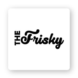
Not every fashion blog logo has to use this formula of thin black lettering, however. The Frisky takes their logo in a different direction, pairing a playful script font that boasts thick lettering with a more traditional sans-serif. Notice how they played with their logo layout to emphasize ‘Frisky’, drawing attention to the curves of the letter ‘F’ to subtly cue their readers into the fact that they’re a blog by females, for females.
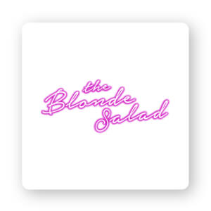
Then we have The Blonde Salad, which is an entirely different take on trying to appeal to the feminine through design. This Italian fashion and lifestyle blog is a mix of edge and pop culture, which is reflected in the glow-in-the-dark-like logo that’s reminiscent of a Hollywood billboard. The cursive lettering adds a personal touch to the logo – fitting for a blog started by a single woman (Chiara Ferragni) who remains the face and brand behind it.
Tech blogs
To say the tech world is booming would be an understatement, and that’s why, if you have a tech blog you need a logo that is spec-tech-ular (too much?). I feel like a broken record, but the most important thing you can do is design a tech logo that speaks directly to your audience.
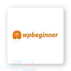
Let’s look at WPBeginner’s logo first. As the largest free WordPress resource site for beginners, WPBeginner’s logo color choice was clearly well thought out. They chose orange, and from what we know about color psychology, it’s a color that can ignite motivation, uplift, and provide mental stimulation. That color choice makes sense because, let’s be honest, learning something totally new like WordPress requires a helpful motivator.
Next, we’ll look at Stratechery, which is a blog that analyzes the strategy and business side of technology and media, and the impact of technology on society. Again, the orange logo color conveys intelligence and optimism. Moreover, the ballpoint pen icon is unique in that it’s made up of lines that look like they came from a boardroom graph.

And if you want to add some movement to your tech blog logo, then take inspiration from Mashable’s animated logo. An animated logo adds effects and movement to the design, ranging from simple effects to a whole change in form (like Mashable).

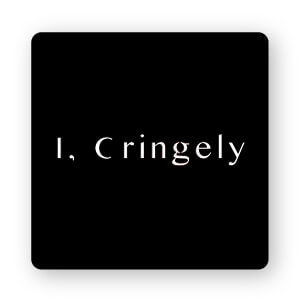
Finally, Cringely is a great example of how in logo design, less is often more. For a tech blog whose allure hinges on the man that started it (Robert X. Cringely at your service!), it certainly makes sense to highlight the individual – which the logo does with the letter ‘I’. And, the combination of white with a modern sans-serif font helps to paint the picture of a current, up-to-date blog that you can rely on for the latest in tech and business, no matter the subject.
Business and finance blogs
Above all else, business and finance blogs must appear credible and knowledgeable.
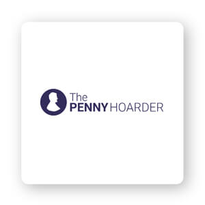
You can create a professional-looking logo by incorporating geometric shapes or icons, such as The Penny Hoarder’s circular logo.
Choose colors that match your blog’s purpose, ideally choosing colors that are associated with the business/financial world, like green, blue, purple, or black.
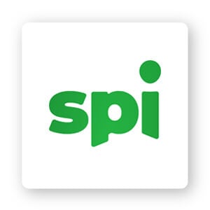
Smart Passive Income uses a green logo and that’s good for 2 reasons. One, it stands out from the other monotonous colors typically used in this industry, and secondly, green symbolizes wealth, growth, and prosperity.
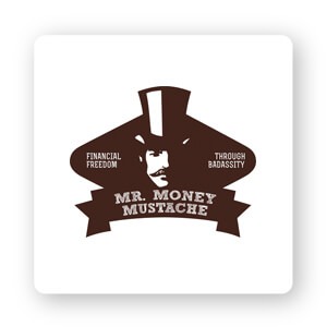
Remember when I said you want your business and finance blog logo to look respectable and credible? That doesn’t mean it can’t be fun! Just take a look at Mr. Money Mustache’s logo. It’s eye-catching, unique, and on-brand, and that’s the name of the logo game.
Travel blogs
Everybody appreciates a good travel blog for helping to plan out their next vacation or learn how to become a digital nomad! Whichever type of travel blog you run, an icon is the most popular choice. Usually you’ll see common symbols like a globe, a backpack, or hiker, but feel free to play around with your icon.
For example, the Goats on the Road logo is literally an outline of a goat standing on a road paved through the center of the letter ‘o’. It’s unique, quirky, and definitely memorable!

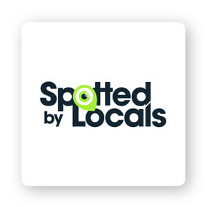
Spotted by Locals is another good icon that is a play on the name of the blog. The ‘o’ in ‘Spotted’ has been replaced with an eyeball that also looks like a pinpoint on a map symbol.
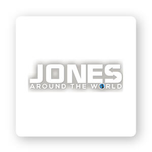
Jones Around the World keeps with the icon-within-a-logo tradition, filling in the ‘o’ in ‘World’ with an entire globe. And, notice how the blog logo uses white space to create arrows within the letter ‘S’ at the end of the word ‘Jones’? Negative space is a great way to include hidden messages in your logo that give your blog that extra unique touch!
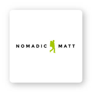
And let’s not forget Nomadic Matt, who puts a backpacker right in the middle of the blog name. Not only does it create the illusion of movement within the logo, but it also makes the viewer able to imagine themselves as a similar nomad – making them more likely to want to click the link to the blog and read more about how they can become one.
Over to You
Now that you know how to make a logo for your blog, it’s time to put your foot on the gas.
Many bloggers view blog and website logo design as of afterthought, but if you want to make a good impression on your audience and come across as professional and credible, you need a well-designed logo to make your mark on the web.
When you’re ready to begin designing, head over to our logo maker to get started!