The UK has its fair share of popular and memorable logos (Jaguar or Cadbury ring any visual bells?), and its newer companies are no exception.
Despite the challenges that the world has faced in the past year, a lot of cool startups have flourished in the UK, and we thought it would be a good idea to review some of their best logos and what makes them so effective.
Below are 15 memorable UK logos that are taking the branding world by storm this year.
You may notice a lot of similarities between the logos – similar typefaces, the same range of colors – so we’ll cover the small differences that make each logo unique.
15 UK Logos From Top Startups
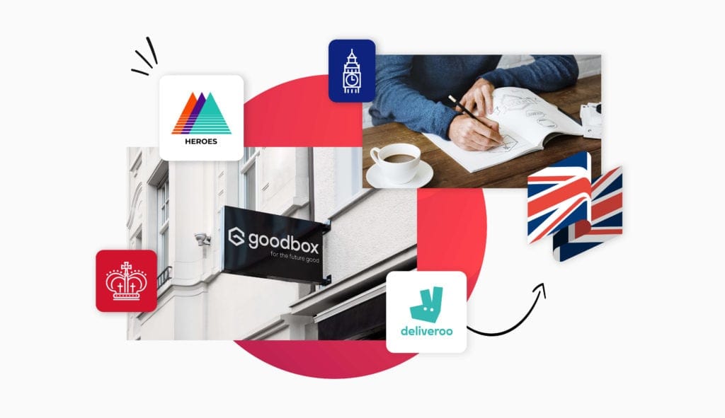
1. Deliveroo

Although they launched in 2013, this food delivery company had its biggest fundraising round this past year ($1.5 billion!) so we thought they were worth mentioning.
Having undergone a rebrand in 2016, their logo now features an energetic teal color palette, with an abstract kangaroo to replace their old cartoon one.
The company’s rebrand is a good example of how to preserve elements of your brand that your audience connects with, while reinventing your design in a way that best reflects the current direction of your business. In this case, they rode the flat design trend to align their brand with other modern innovators like Instagram and Uber.
2. Zopa

Another rebrand from the past few years, Zopa’s current logo features a bold, clear typeface. As the first peer-to-peer loan tool, Zopa had to gain the trust of their audience, which is why their turquoise and white color palette is friendly and inviting.
Zopa’s design is a great example of how you need to consider your industry before designing your logo; a finance-related company like theirs needs to have a logo that reassures their audience they’re safe to do business with.
3. Cazoo

This startup “newbie” is like the Etsy of used cars.
Their brand is all about helping people find and purchase quality used cars, and have them delivered within 72 hours – which is why a car is cleverly featured right within the typeface of their logo. The burnt orange color palette symbolizes energy and excitement, hinting to their customers that their new car will instantly lead them to adventure.
4. City & County Healthcare Group

This group is the UK’s largest provider of healthcare services, spanning everything from home healthcare services for the elderly to private care for young people with disabilities or brain injury.
Notice how their diverse audience is reflected in their logo; can you see how the circle is actually made up of differently-colored “people” holding hands with one another?
The circle both symbolizes the circle of life and healing, while the colors indicate trustworthiness and professionalism. And, they’ve used a modern sans-serif font that’s easy to read and gives off an honest, sensible feel.
5. Echo

Simplifying the pharmaceutical process, Echo makes it easy to order prescriptions online and for free.
The platform’s ease of use and technological edge are reflected in their design; for example, spirals – like the one in their icon – are often used to symbolize a flow and thinking outside the box, which is a great choice for tech companies that want to show they’re doing something different. And, the criss-cross shape helps to reflect that Echo’s entire platform is connected, and that you can do everything you need to right from there.
Lastly, the light green of their color palette points to relaxation and ease, while the nearly-black-darker-green reassures their audience that they’re in reliable hands.
6. Hayfield Homes

This luxury property and housing service company was founded in 2016, and it now has over 60 employees.
They recently struck a deal to build 80+ eco-friendly homes in Bedford that are equipped with luxury facilities (floor heating, charging ports for electric vehicles, etc.).
Their emphasis on luxury and impeccable design is clear from their wordmark logo, which features a clean, all-caps, sans-serif typeface in trustworthy navy. Notice how their logo is simple; they don’t even use an icon, which likely helps their audience envision their own home design dreams and see Hayfield’s as the way to bring them to life, rather than being “boxed in” to Hayfield’s vision.
Remember, in logo design, less is often more!
7. City Pantry

As a corporate catering and office food delivery service, City Pantry was in high demand during the lockdowns of 2020. Their logo makes it easy to understand what they do, from the obvious fork and knife rising out of an office building to a name that hints to the fact that they can feed a whole city’s workforce at once.
The logo was changed to its current design after being acquired by Just Eat, in order to display a connection between the two brands, and the shared orange-and-white color palette reflects an energizing, appetizing, and hygienic message.
8. Wakelet

The Wakelet logo is a great example of how you can incorporate design elements within a wordmark to give off your message. A tool to help you manage all of your social media content in one place, Wakelet uses the wave in their logo to emphasize the connection between platforms.
And, the blue and white palette promotes trustworthiness and elicits feelings of tranquility – perfect for a brand that’s trying to help their audience make sense of what can feel like social media chaos.
9. Heroes

Heroes is the startup that believes in startups – specifically in FBA (Fulfillment by Amazon) businesses. They pick out the most promising companies, audit them, and then make them an offer.
The various colors in their logo help to reflect that they’re sector agnostic (as in, they don’t favor companies in one industry over another), in addition to reflecting innovation and passion. And, when facing upwards, triangle logos like this one symbolize upwards momentum – which is underscored by the gradually thinning gaps between the lines at the bottom.
10. Rhino Products

Who knew a local van accessory business would grow into an international company? Yet Rhino Products did exactly that, expanding into an entire commercial vehicle accessory business with over 140 employees.
They used an animal logo – a rhino – both to emphasize their name, and to play into the connotations people tend to have with rhinos, like their durability and power. And, their large, black, thick-weighted typeface reinforces that message, showing how important it is to have a harmonious fit between all of the individual design elements in your logo.
11. H4

Are you looking at this design and thinking, “how can a good logo be just one letter”?
Well, you’d be right in some cases, but this logo actually has a twist on the classic letter “H”! It’s broken up to simultaneously look like both an “H” and a “4”, hinting at their name in just one mark (something you can consider in your own logo design).
The London-based platform specializes in creating and analyzing important documents, with an emphasis on data collection, and their logo reflects that through its clean-yet-edgy design.
12. Equipsme

An important part of creating a good logo is knowing the stereotypes people hold about your industry, and this logo does exactly that.
A company that provides insurance to UK businesses, Equipsme went with a color palette that infuses energy into the concept (yellow), while showing that they’re serious and professional (gray). And, their font is easy to ready while being slightly rounded, giving off a friendly, playful energy.
13. Darktrace

This AI-driven cyber defense company now has over 44 offices all over the world, though they originated in Cambridge. As a leader in the cybersecurity world, it’s important for Darkface to present a trustworthy character – starting with their logo.
Notice how their logo could potentially reference a threatening thing (cyberattacks), so they use a pop of color in their icon to show that they’re approachable. Gray, a neutral color, helps to balance the dark, which hints more toward security and reliability. For a cybersecurity company, getting this color combination right is especially important for attracting the right audience towards your services.
14. Pawfect Match

Though this logo is a little more involved than most of the others you’ve seen on this list, we thought it was worth mentioning as another way of thinking about your own logo.
As an app that connects UK residents with homeless animals in the area, Pawfect Match uses their logo to instantly send a humanitarian message to their audience. The color palette is eye-catching and dramatic, while the hearts hovering in a pair of hands symbolize giving and care. And, notice how the logo uses white space to further show images of a paw print and puppy, reminding onlookers of the app’s name and what they do.
Although we’d normally recommend against using so many elements in one logo, in this case, it works.
15. GoodBox

Compared to the above, the GoodBox logo has a very different take on how to communicate a humanitarian cause.
They offer a contactless donation solution for homeless people (as in, you can just tap your credit card onto a machine and instantly donate money), and the technological innovation is what’s emphasized in their logo. Notice how they use just one color – purple, which is often used in tech companies to symbolize a “magic” solution – and sport a monogram with a modern, edgy, innovative twist.
Over to You
Now that you’ve seen a bunch of UK logos from a bunch of different startups, have you begun to imagine what your own logo could look like?
Hopefully, you’ve learned that logos don’t need to be complex in order to make a strong impact. In fact, we saw that some of the most successful UK logos use no more than one color and a simple font.
Have you started to think about your own logo design yet? Try out Tailor Brands and create the next memorable UK logo!