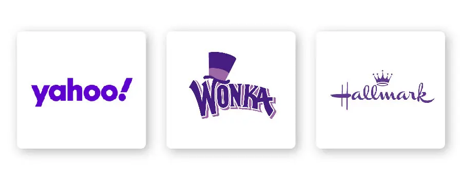
Serif – Ideal for businesses that want to appear established, respectable, and trustworthy.
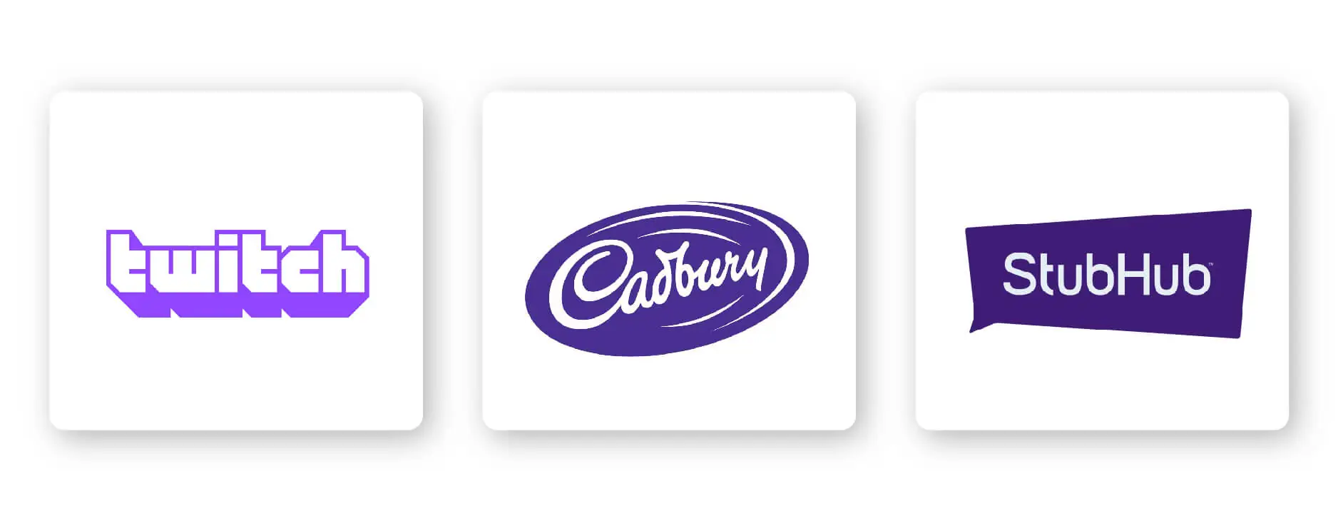
Sans-serif – Casual, easy to read, and modern, sans-serif is a popular choice among start-ups, tech businesses, and even entertainment brands like StubHub.
Slab serif – Bold and impactful, slab serif fonts are frequently used by car and technology companies. Mostly, slab serifs are fun and make an audience feel happy.
Script – Well-suited for businesses that want to express elegance and luxury, such as Cadbury chocolate.
Decorative – This is a font that’s loud, fun, and entertaining, which is why it works for companies like Twitch.
Of course, these are just general rules, but by no means are they set in stone. Feel free to play around with different font combinations.